
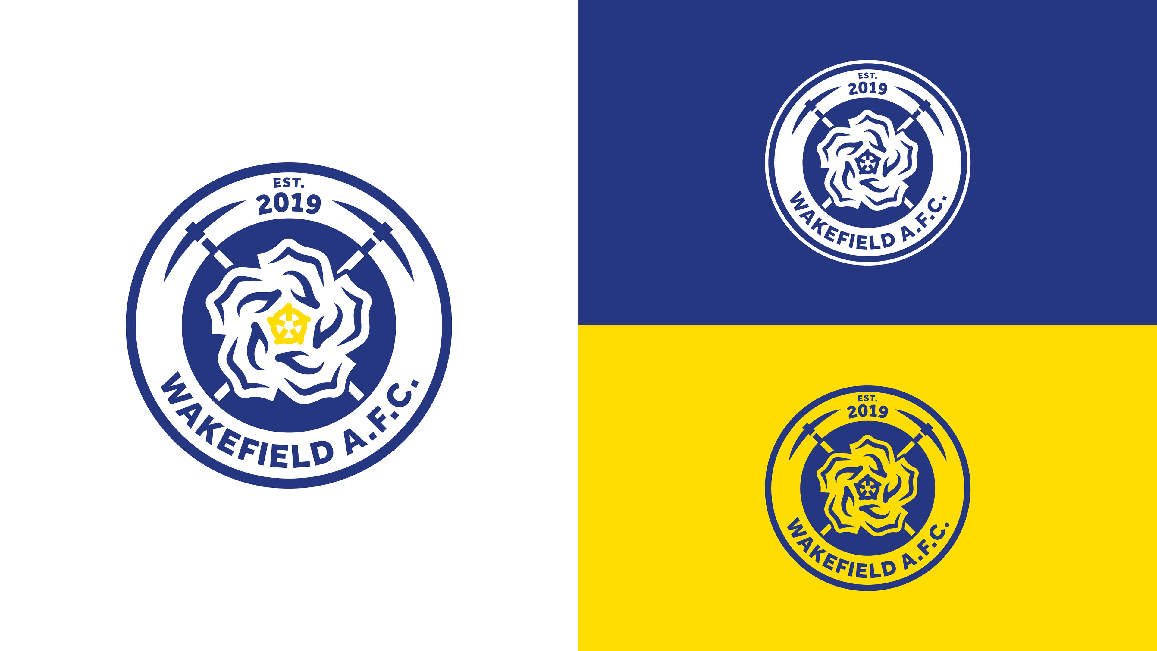
Wakefield A.F.C. required a modern logo to invigorate their push towards becoming a Football League team for the first time in their history. Studio Volk created something which embodies the rich sporting and mining heritage of the area, but also a logo that could be adapted and co-opted by the fans of the club.
The two main aspects of the logo are made visible, the white rose of Yorkshire and the five petals representing the five towns of Wakefield. The crossed mining pickaxes in the background elude to the traditions of the area and it being the city where the National Coal Mining Museum is situated. A set of brand guidelines was also produced for internal use within the club.
Primary logo – used at larger scales and official club correspondence

Secondary/fan logo – A simplified version of the logo which is easily replicable and understood


Full brand guidelines that accompany the new brand

Examples of club merchandise